Design magic, minus the drama
Real design by Roxana. Humour included upon request.
Portfolio

About the author
Every design begins as a spark, a vision waiting to take shape.
As a new designer, I’m learning to turn ideas into experiences, blending creativity with purpose.
Each project is a chance to grow, to express and to leave a mark that feels authentically mine.
Business card
Eulogy
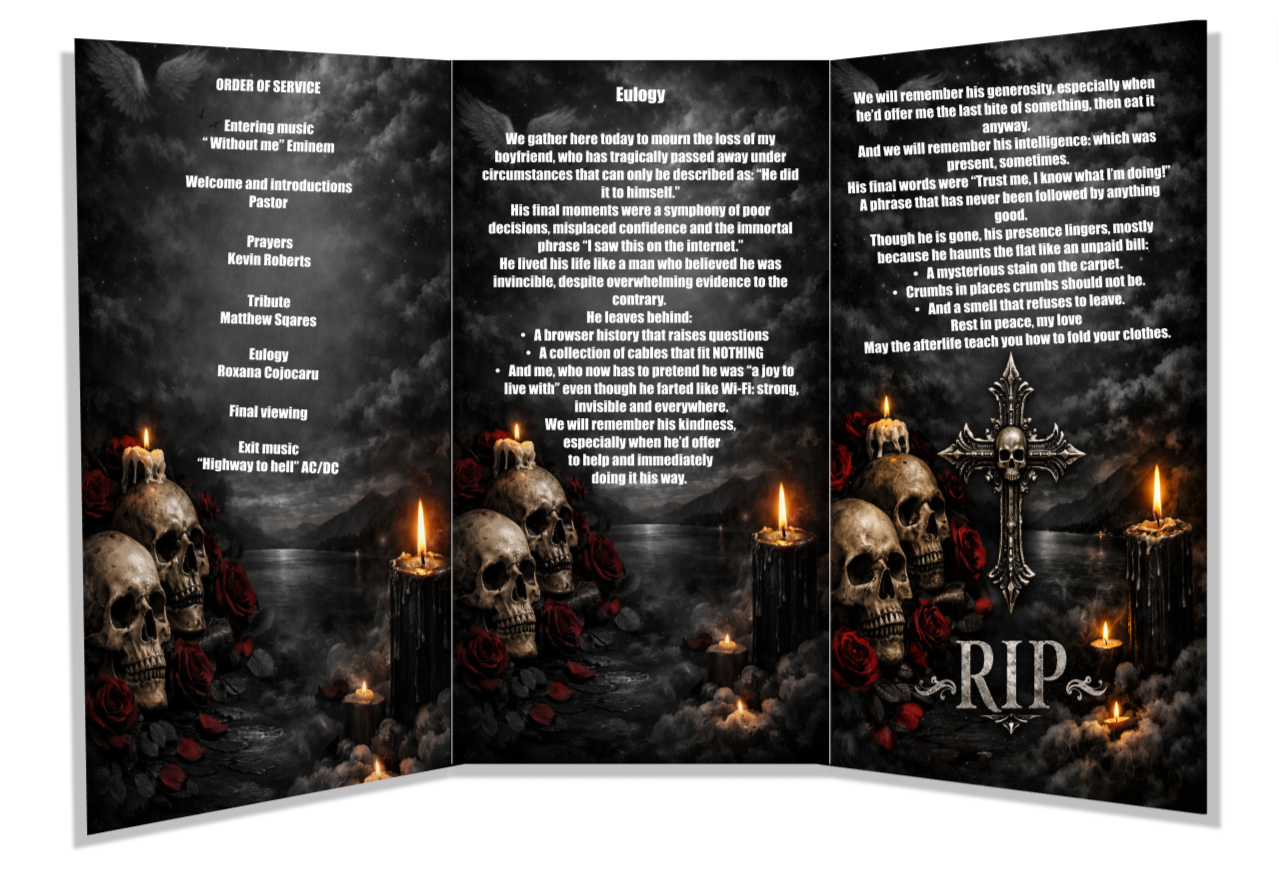
The eulogy I wrote for my boyfriend became one of the most emotionally complex pieces I’ve ever crafted, a blend of storytelling, design thinking and personal truth. I approached it the way I approach any meaningful project: by shaping raw emotion into a clear narrative, balancing contrast and letting authenticity lead the composition. Instead of smoothing out the imperfections, I highlighted the quirks, humour and chaotic charm that defines him, creating a piece that feels both deeply personal and thoughtfully design. It reflects my ability to translate lived experiences into creative work, shaping tone, pacing and emotional hierarchy the same way I would structure a visual layout. In the end, it starts as a reminder that design isn’t just about aesthetics, it’s about communicating humanity with clarity honesty and heart.
Anxiety brochure
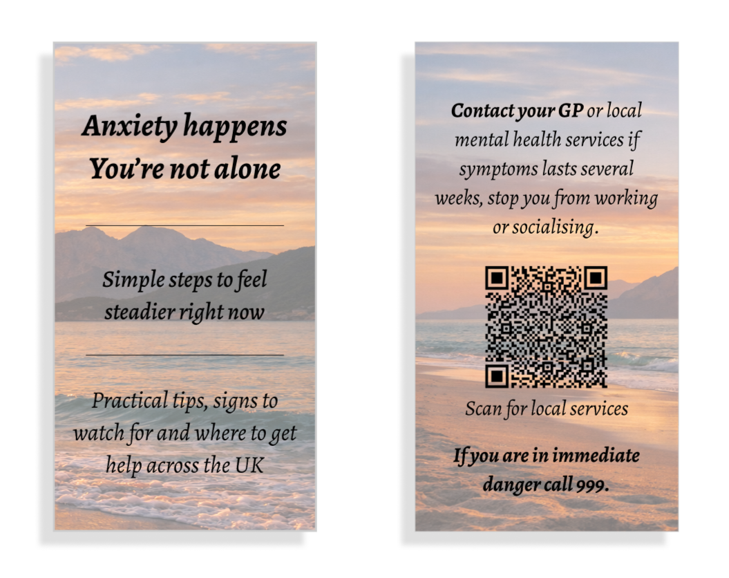
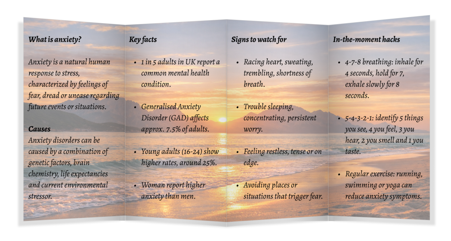
This anxiety brochure was crafted to feel calm, accessible and visually reassuring. The soft sunset background sets an immediate tone of safety and warmth, helping reduce the intensity of a topic that can feel overwhelming. I structured the content into clear, digestible sections so readers can scan quickly and find what they need without cognitive overload. Each heading is concise and purposeful, guiding the eye through a logical flow, from understanding anxiety, to recognising symptoms, to learning practical coping tools. The bullet points keep the information lightweight and approachable, while the grounding techniques add an interactive, user‑centred touch. Overall, the design balances clarity, empathy and visual calm, creating a resource that supports the reader both emotionally and practically.
Café menu
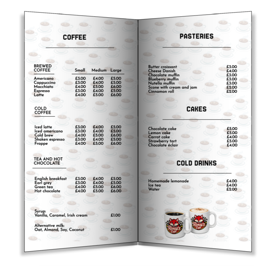
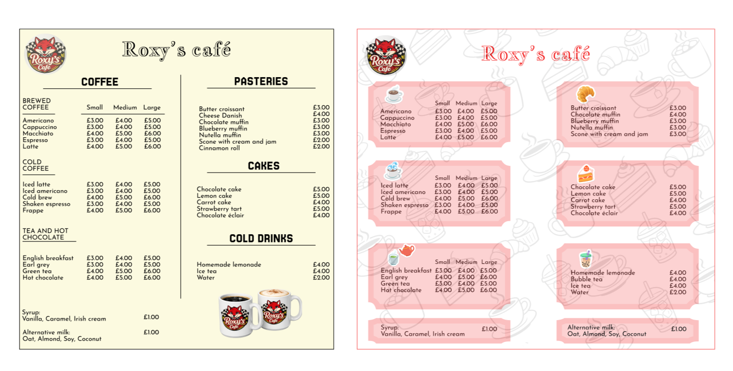
This café menu isn’t just a list of drinks and treats, it’s a visual experience that guides the customer through the brand’s personality. Every choice, from the clean layout to the warm, inviting typography, was made to balance clarity with charm. I focused on creating a hierarchy that feels effortless: bold headers that anchor the eye, soft sub‑text that feels friendly and spacing that gives each item room to breathe. The illustrations and icons add a handcrafted touch, making the menu feel personal rather than corporate. Overall, the design turns something ordinary into a moment of connection, letting customers feel the café’s identity before they even place their order.
Christening invitations
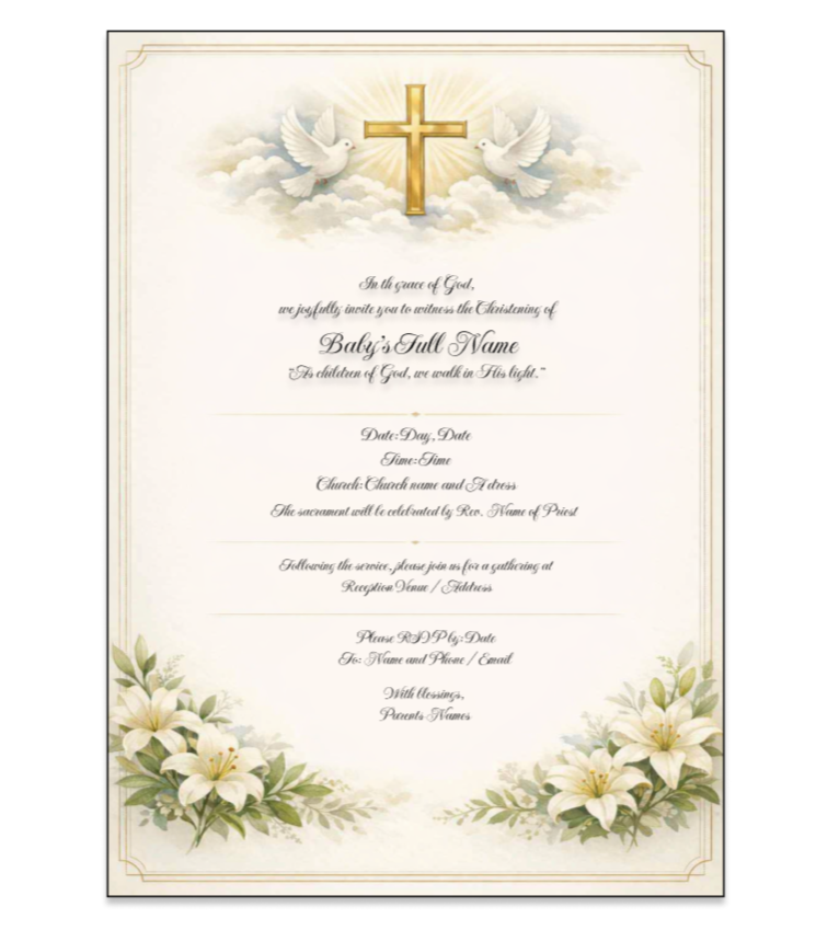
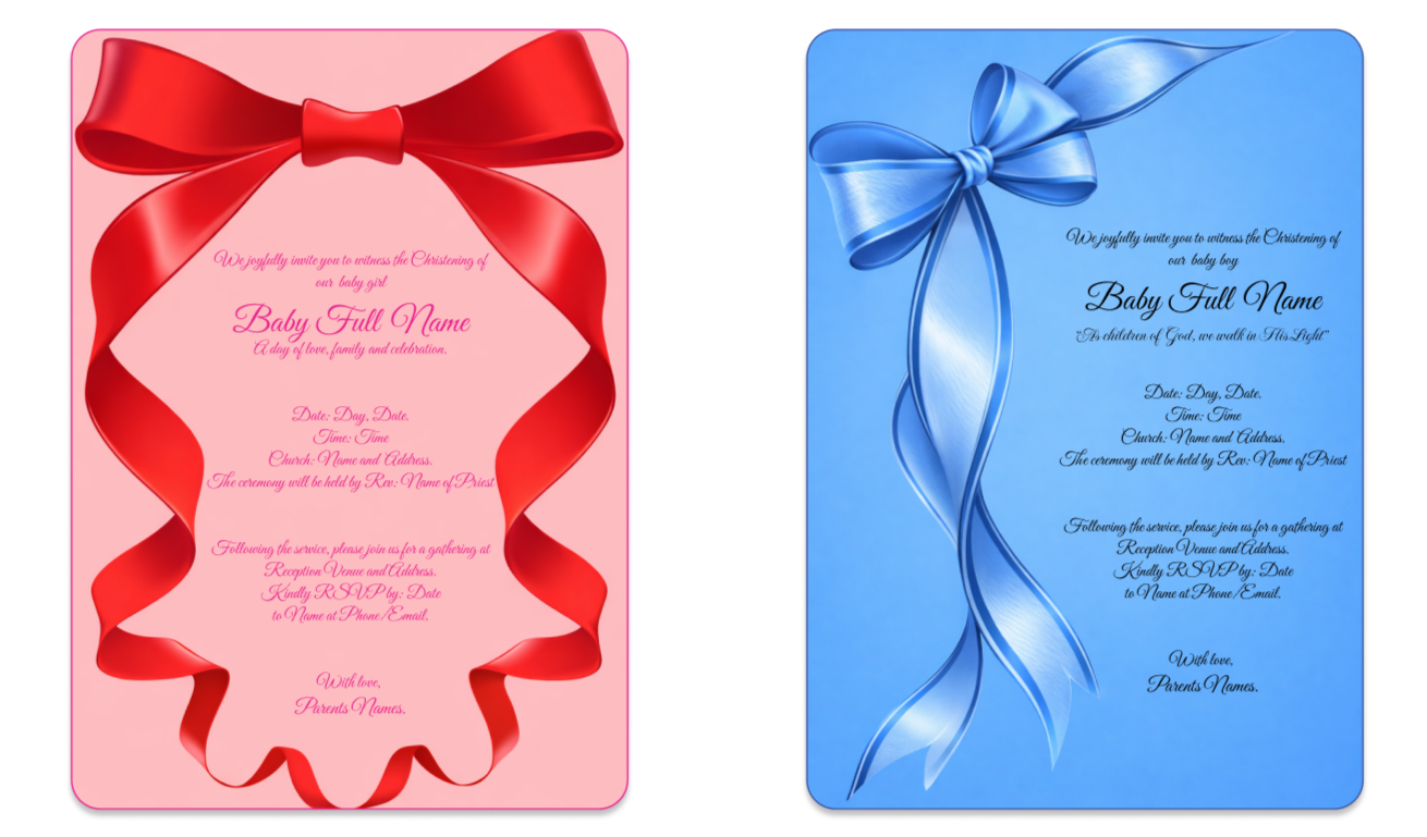
I design each christening invitation as a blend of sentiment, symbolism and soft visual storytelling. My focus is on creating pieces that feel deeply personal, gentle palettes, serene illustrations and thoughtful layouts that honour the purity and significance of the day. Whether I’m crafting a religious design with subtle spiritual motifs or a modern, minimalist layout with delicate baby silhouettes, every element is intentionally placed to evoke warmth, love and celebration. I design with families in mind, ensuring each invitation becomes not just an announcement, but a keepsake that captures the beauty of welcoming a child into faith and community.